Monday, 21 March 2016

" Perfectly Imperfect"

Hi everyone and thanks for stopping by today at my blog. I hope you like what I have created for you all to see. 

Today I would like to share with you all my latest Design Team layout over at Color, Stories and Inspiration.

This one is for case file number 193.

I couldn't find a photo to go with these colours and was going to revert to the black and white photo,
Then I remembered a recent trip to the beach with my hubby and knew some of the photos were still on the camera. Playing around with some of the settings, this one came out really blurry as you can see, but when my hubby saw the photo his comment was 
" That's the best photo of me "
So how good is the title for these photos of him??


The layout has a real rustic/beachy feel to it.
I tore some of the paper away and then distressed the edges. I added some thin strips of hessian under the edges too. The orange beading is called sand and I raided hubby's shed. It was just sitting on the shelf not being used.
I love to use plain straws, add washi tape to them and then add them to my layouts.

Case file no 193
Case file elements:
The Scheme- blue, pale celadon green, olive green, bright orange and black.
The evidence- I used the following; string, birds, frames, flowers, shells, nautical elements, labels.
The testimony- I framed my journaling and wrote from 365 Questions What relaxes you?
Relaxing at the beach. I love to fish, I love to surf, I love the sound of the waves, I love to stand and listen and think at the beach.


I used a frame to hold my journalling. 


Lots of stamping and paint splatters. I used a stencil to 
get the effect of the birds flying across the page.


Love the title for this page. Its just suits the photo and my hubby so well. 
The orange sand was a little pale so I covered it with orange silks paint.


                     A piece of chippy chains covered in Viva Ferro Special effect paints. 
I tried to add a few beachy items like the fishing net. I made this myself from string. 
A few shells from the beach and anchors, ships wheels.
 

Love the texture in the flowers for this page. 
Black polaroid frame for one of the pictures and the other frame was left overs in my chipboard box.
 Its a box that I keep near where I am working and it holds all those little leftovers pieces and the blanks.
 I love to use both the positive and the negative of the chipboard.


Corrugated board which I covered with gesso and then edged with distress ink.
The thistle chipboard I left natural but added green 
Micro beads to the ends.


The anchor was die cut out them I used the Viva Ferro paste.
Black splatters and white splatters finished off the layout.

some of the items I used;
Kaisercraft papers - Blue Bay Collection " Shimmer" 
Black bazzill
hessian
Life Documented Photo stickers
Me and my Big Ideas - Mambi stickers & Pocket [ages stickers
2Crafty Thistle shrub and chain lengths
Plaid black metallic paint
Ceramcoat; Blue Jay & white
Silks Apricot nectar
Viva Ferro Special Effects paint
Deco sand (Bunnings)
Petaloo flowers; Wild mini blooms, textured elements textured blossoms Moss green, Faux dried mini, grey/blue & purple/green, printed Darjeeling, Darjeeling Mini Mix Teastain.
Distress Ink - vintage photo & peeled paint
plasterers tape
bird stencil
shells
wooden anchor & ships wheel
straws
washi tape
string
micro beads -Green
corrugated board

thanks for stopping by
till next time
keep on scrapping

Carol xx


Thursday, 3 March 2016

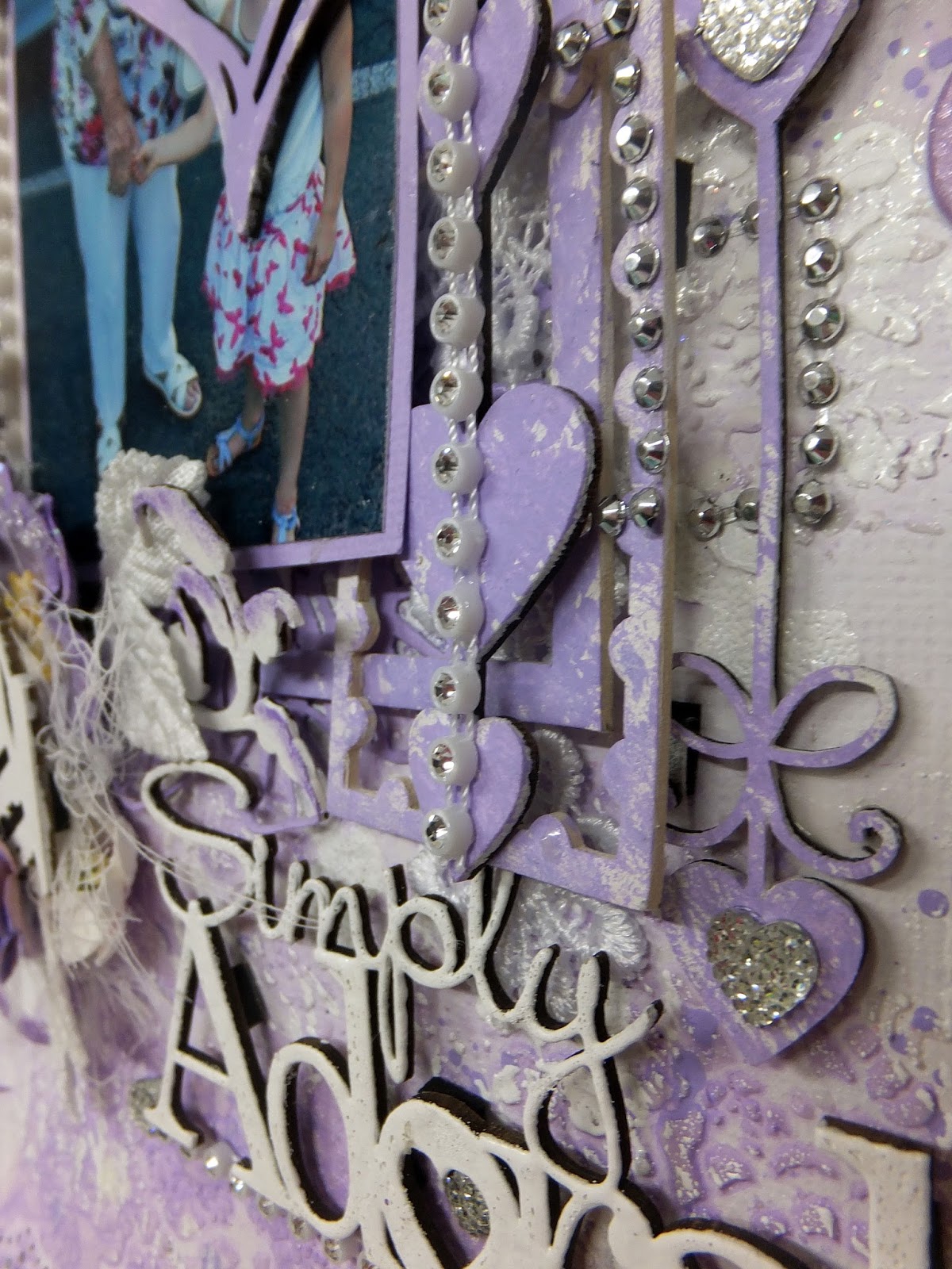
" Simply Adorable "

Hello everyone,
 welcome to another White With1 challenge. 
I want to share with you all my design team layout for this months colour,   'Lavender '

I just love this colour, its just so pretty and so girly. Everything I just love to do. This is a photo of my Mum and my Grandaughter Emelia. My Mum lost part of her finger when I was about 6 months old opening a can of baby food. Emelia was so intrigued that 'Little Nanny" (that's what the grandkids call her ) finger that she wouldn't let go of it, that's what Mum is laughing at. 


Torn edges top and bottom and then inked. I random punched these edges. 
Lace peeking out just adds that girly feel.
I used a stencil and added some Impasto then Gelatos and water to get that soft inked look.
White ink with white embossing powder with a script stencil.
I find that the white ink from Stamping up just wont dry but if I use embossing 
powder over the top and heat set it, its brilliant.
You will see that the script writing is running down the page. This is because I was going to run the 
page the other way but I liked it more the way it is.


This is the March colour at White With 1. 
There are some great prizes up for grabs, so why not have a 
go and play with this gorgeous colour.


The ScrapFX and 2Crafty chipboard have been painted and rubbed with a white shimmer ink
from Mr Huey. I love these strings of diamante  and think they look gorgeous running down the page.
Plus the little diamond hearts just finish off the jewels.

Lots of layers as usual. I don't think I could do a 'flat ' layout. I did several 
layers of white embossing on the title till I got the look I was after. 
Not as smooth as I normally have 
but I still like it.


I have been trying to use lots of those left over pieces of chipboard that we all seem to accumulate
and in this layout I found some 2Crafty pieces that I painted white and added some
 of the lavender Gelato to the edges.
I added some Lavender splatters to the background to finish it off.


I found the bridges in my chipboard left over box. Yes I have a plastic tub/box that sits on my 
work space and I put all my left over chipboard pieces in it. When I do a layout I am trying to 
get into a habit of checking this to see if there is anything I can use.
Love these D-lish flowers and my 'little bird" peeking 
out over the top. I think he is gorgeous.


Flourish with Bling puffy flourish on the background was just the perfect colour. Some more chippy 
vines that I painted white. 
Well there are lots more to see on this layout and I do love to add lots of little 
bits and pieces of yummy goodies.

Till next time
keep on scrapping 

Hugz Carol xx


Some of the products I used:
White cardstock
Ceramcoat paint
2Crafty Chipboard
ScrapFX chipboard
D-lish 'After 5 Flowers'
Prima flowers
Petaloo flowers
Enthaily flowers
Gelatos
Mont Marte diamonds


Sunday, 28 February 2016

"Favourite Memories"

Hello again,
 thanks so much for dropping by.

Today I'm sharing a very vintage layout that I completed as part of the design Team at Color, Stories and Inspiration for case file 192. I loved the darker colours in this case file and to me they just screamed vintage.

This is a photo of my Dad's mother " Ann" as a young girl.
I decided that this time I was not going to re-touch the photo at all. I thought it was just perfect the way it was..


Lots of case file elements in this one. 
The tearing of the papers, the old fashioned newspaper prints then all inked in aged mahogany distress ink looks amazing.
This is case file 192 as easy as 1 . 2. 3
1. The Scheme all 5 colours here -  Charcoal gray, Light gray, White, Flax yellow and Maroon
2. The Evidence I used the following-  newspaper, birdcage, bird, heart, leaves, flowers, vintage elements, distressing, and tearing.
3. The Testimony- I wrote the testimony on the back of the layout and I wrote a list of at least 7 things. I did it in the form of the family tree and was bale to go back 8 generations.


I found this piece of old lace in my stash and I think it just goes beautifully here.
All the chippy pieces and the wooden birdcage all were painted then I rubbed
inka gold paste and finished  them off with a few micro beads.


Lots of flowers on this layout (as usual) I rubbed a little inka gold paste 
on some of the flowers for this layout. I picked up the little yellow resin flowers in  Officeworks, gorgeous and self sticking.


Love the added Microbeads


Lots of layers of papers, wooden clock and the die cut paper clock.


I found this " Mont Marte"mannequin in one of the $2 shops in my area, little bit 
of dressing up and I think it looks very vintage.
 Just the right embellishment for this layout.

Some of the items I used:
Plain cardstock
Carta Bella  paper " Yesterday Ads "
Kaisercraft  paper - Art of Life collection  " " Creative"
Ceramcoat - Maroon
Jo Sonja Naples yellow
Mont Marte Mannequin
2 Crafty Cartia's swirl
Scrap FX chipboard
Green Tara flowers - Blossoms Ochre, Blossoms, Fantasy blooms
Petaloo flowers -Wild Mini blossoms
Prima Flowers - Parchment petals scrolls, Cartographer Adventurer
Officeworks-  resin flowers
Micro beads
Inka Gold paste
wooden birdcage and bird
lace


Thanks for stopping by
till next time
keep on scrapping

Carol xx


Saturday, 27 February 2016

WooHoo !!! I've been published

 Hi everyone, thanks for stopping by and welcome back to my little blog.
                Time for me to brag a little. 
One of my layouts is in the current issue of Scrapbooking Memories, no 18 issue 11. The submission was " Heroes"
                 To say I'm excited is an understatement,


As you can see it made the front cover. 
To me it doesn't matter that it just a little picture on the cover, 
it's still on the front cover.


This is the layout that I submitted to the magazine. Its of Jake and my parents taken when he joined  the Army. Dad is gone now so that makes this page even more special.


The inside page !!!

thanks for stopping by

Carol xx